Hesed
Hesed is a Hebrew word that appears often in the Bible. I’m no Hebrew scholar, but my online research tells me that this word refers to lovingkindess - of God towards his children, and of people towards each other.
“Hesed means loyal, steadfast, or faithful love based on a promise, agreement, or covenant. Sometimes the word is used of God’s covenant-love for His people and sometimes, as in the story of Rahab, of relationships on the human level.” Also: “Hesed indicates faithfulness to a relationship. To show kindness or hesed is to act in a loyal, loving way to a person.” Source here.
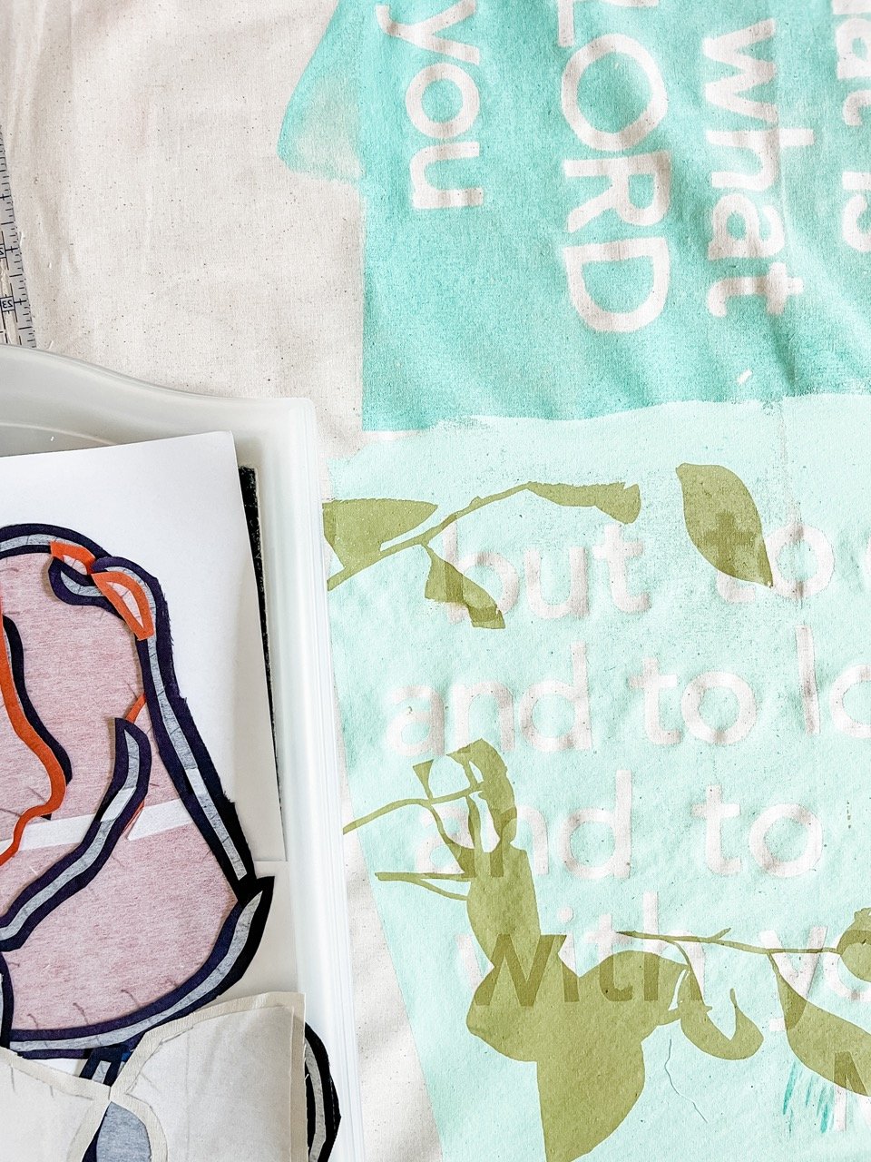
I was invited to create an artwork for the foyer of our local, church-run aged care nursing home. I was asked to base it on the idea of ‘hesed’. Faithfulness to those who are older than us, through loyal and loving care is a great privilege and gift. Interaction between generations, and joy across the generations is something I have previously covered in my art, so it was interesting to ‘go there’ again in this new artwork.
Although I initially lectured myself not to make this large artwork too complicated, but natural tendency to include all the things took over, so it became one of my more complicated pieces. (Faces and hands ALWAYS complicate things!). An artwork like this starts with a lot of sketching. I try to keep my sketching fairly simple, and focus on the posture of the people, as well as the way they are engaging with each other. You can capture so much feeling in how the figures are placed in relation to each other, with regards to posture and eye contact! I’m also conscious during the sketching, that the piecework quickly gets very complex, so that it’s good to keep out any unnecessary linework.
After the initial sketching process, I selected favourite images, which, altogether, tell the story of hesed in an aged care facility. I had a rough size to work to for this artwork, so the next step was to play with various ways to incorporate and arrange the images. I have to work so hard to keep some quieter spaces in my artwork! The original drawing had lots of ‘white space’ until I started adding screenprinting and patterned fabrics :).
I was also asked to make it somewhat colourful, so I wanted to do this in a way that was warm and soulful, but not too childlike. This is where I pulled out some of my favourite hoarded fabrics - the Gertrude Made floral bark cloths. I love the texture of this fabric, as well as the patterns and colours, and used these as a basis for my colour selections, matching my hand-dyed fabrics to these. Many of the residents in this home have Dutch heritage, so it was fun to also incorporate a nod to that with some Dutch-inspired fabrics - Delft blauw tiles, and bikes, tulips and Dutch houses, also in the blue colour.


