On the Joy of Illustrating Someone Else’s Picture Book Manuscript
One dream I have is to illustrate my own picture book (one that I have written myself). It would be interesting to be able to develop the words and illustrations in tandem, with one feeding and inspiring the other, and vice versa.
At the same time, I absolutely love the creative challenge of working with someone else’s words to create illustrations that tell a beautiful story. One thing that really struck me when I took a class on writing picture books, was the lesson on not writing things that will be obvious in the illustrations. A picture book has a very limited number of words and you don’t want to waste them on superfluous points. On the flip side, as an illustrator, you get to do your own story telling in addition to the words. As an illustrator, you get to create your interpretation of the characters depicted in the text. Sometimes that freedom extends as far as deciding whether you will illustrate human or animal characters. An activity I like to do with school students when we talk about visual literacy, is to read out some of the text of the book ‘Shine’ before showing any of the illustrations. When you do this, you realise that there are so many different ways in which this book could have been illustrated - for example, it could have featured animals, or each page could have featured a different family.
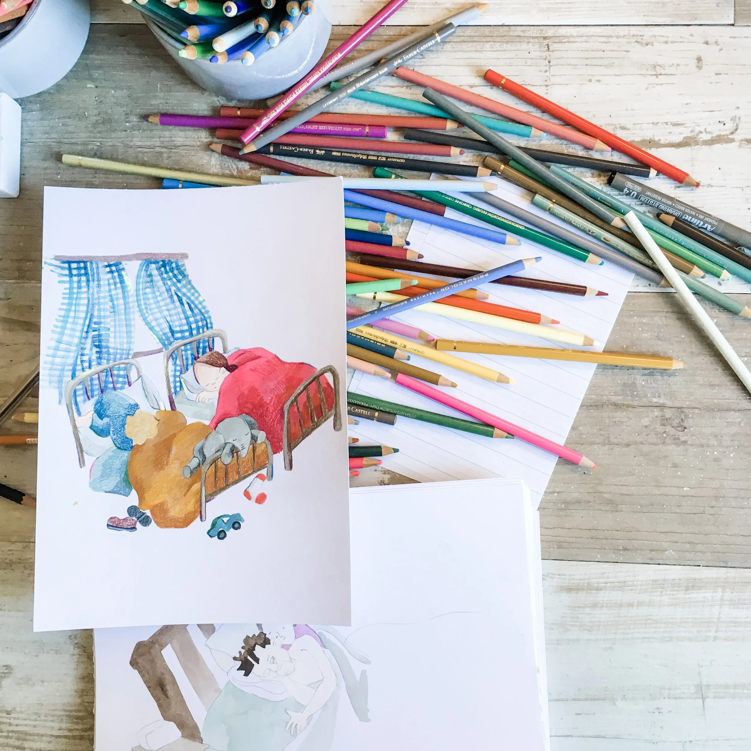
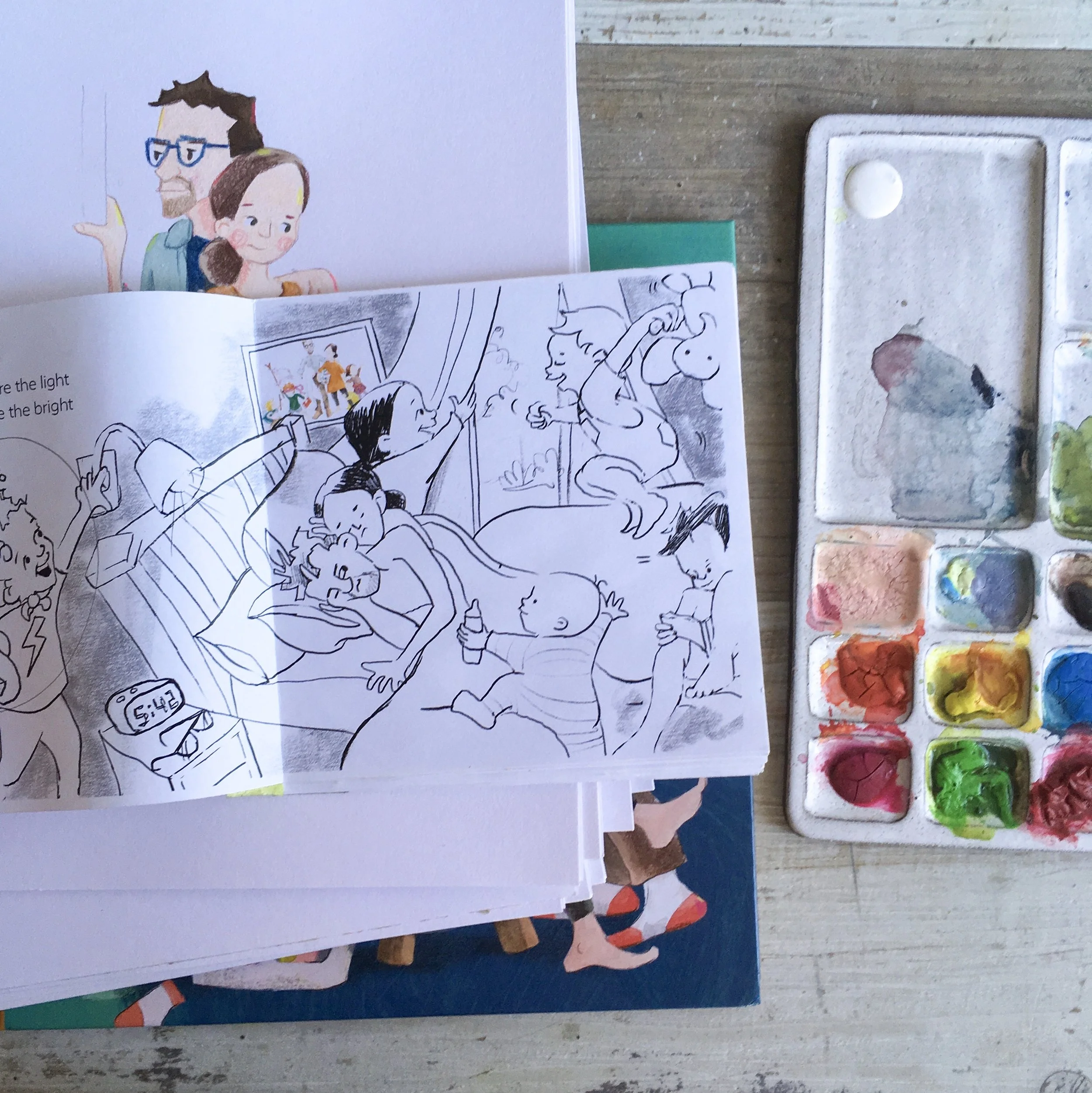
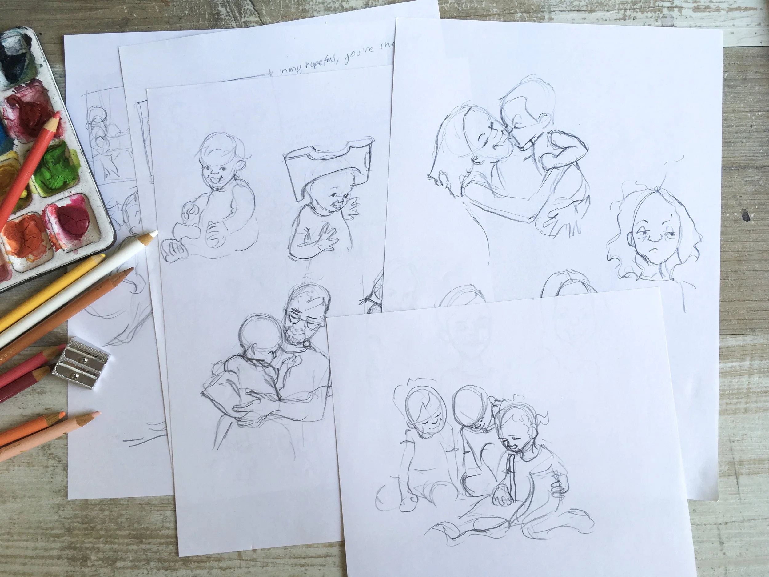
As an illustrator, I also get to breathe a lot of life into the story in the facial expressions and postures of the characters. It’s been so much fun learning how to do this, and I’m so thankful to see that this has translated through to readers, as referenced in some of the reviews below. As an aside, this is a skill I have been able to take back into my textile art as well, when working on faces.
An illustrator can also have a lot of creative freedom in creative environments in which the characters exist. This adds a whole storytelling element of its own! I can bring the reader in close to a scene, as if they are part of it, or give them a bird’s eye view, creating some distance, but letting the viewer in on the bigger picture that the characters might not have.
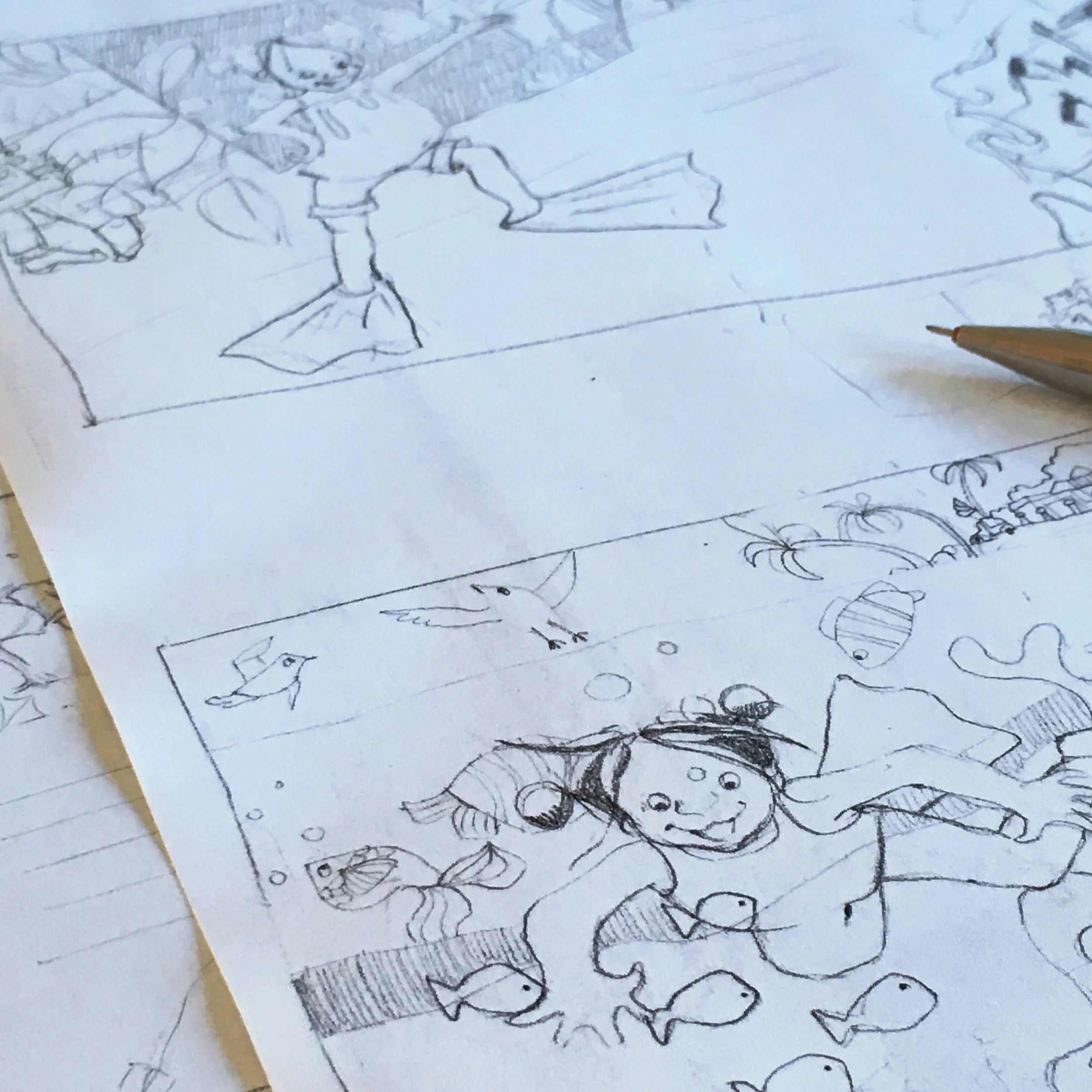
In Barefoot Bea, I have a bit of fun adding seagull characters that help to tell the story, as well as a baby that takes good note of Bea and her lack of shoes. These little details are so much fun to add, and I know that in my home, we love looking for those kinds of details in our picture books (Richard Scarry, anyone?).
I’ve always maintained that setting parameters fosters creativity (for example, in my textile art, I stick to a select range of techniques such as hand-dyeing, screen-printing and piecework, or in a creative challenge I might set a theme and size for a daily drawing), and I feel that illustrating someone else’s manuscript works in the same way. Having the ‘constraint’ of someone else’s words probably brings out some of my best illustration work!
From some of our book reviews:
“Illustrator Ruth de Vos has created a marvellous character in Bea – her cheeky, fearless spirit shines through on every page. I cheered for her, and wanted her to triumph – while also empathising with her parents. Strong-willed children and miraculous and energy-draining in equal measure.’”
“Ruth de Vos’s illustrations add so much to this stunning picture book. Each spread dives deep into a family moment with loads of colour and glorious details. I think all readers (big and small) will find themselves somewhere between the pages, and you’ll have a ball devouring the pictures and falling into the details of home. ”
“Illustrator Ruth de Vos uses bright and bold pictures to tell the story. The double page spread of a cartwheeling sequence is especially gorgeous – with a simple colour palette, bold lines and Bea’s fun expressions. De Vos has a knack for expressions and each character is full of personality.”
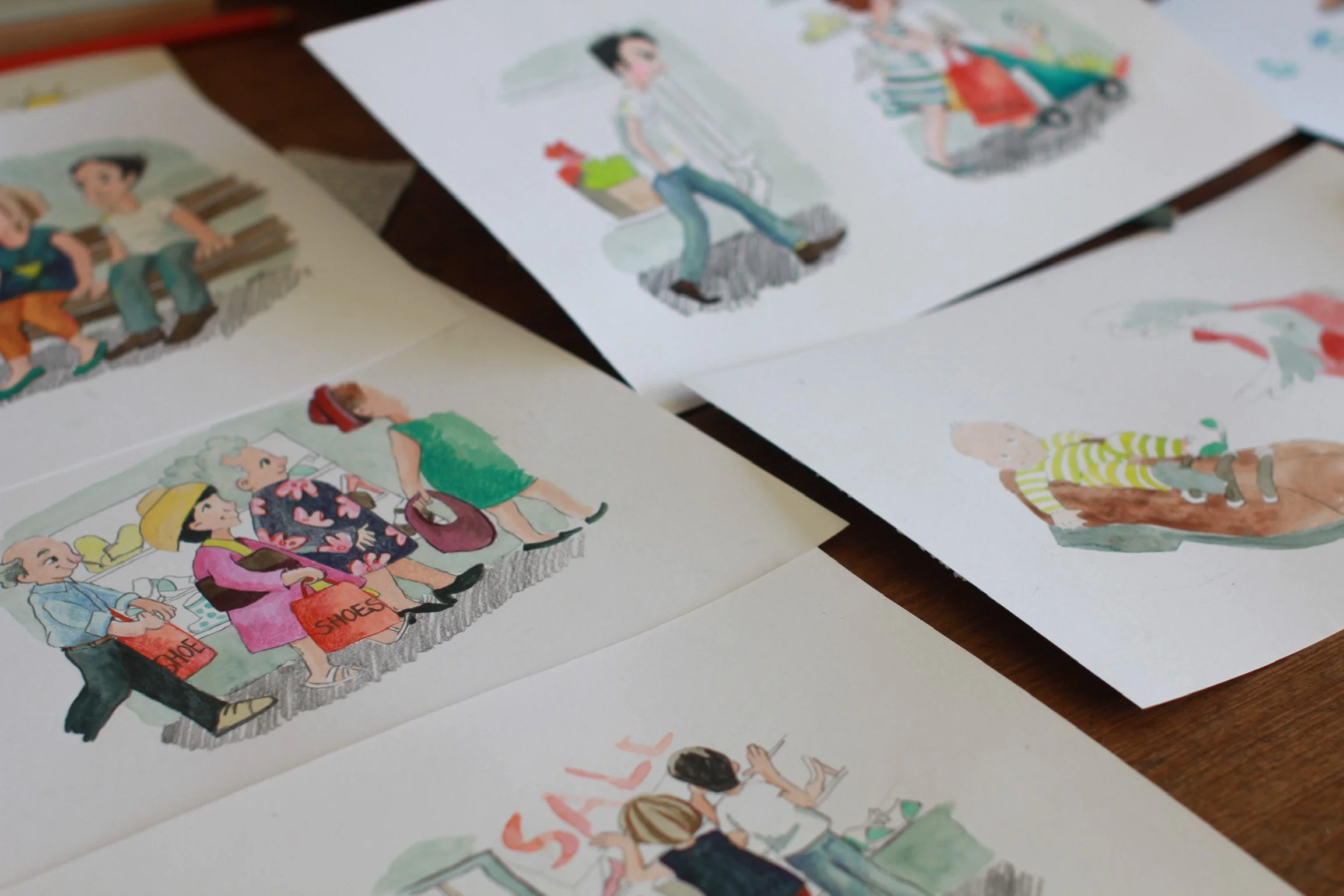
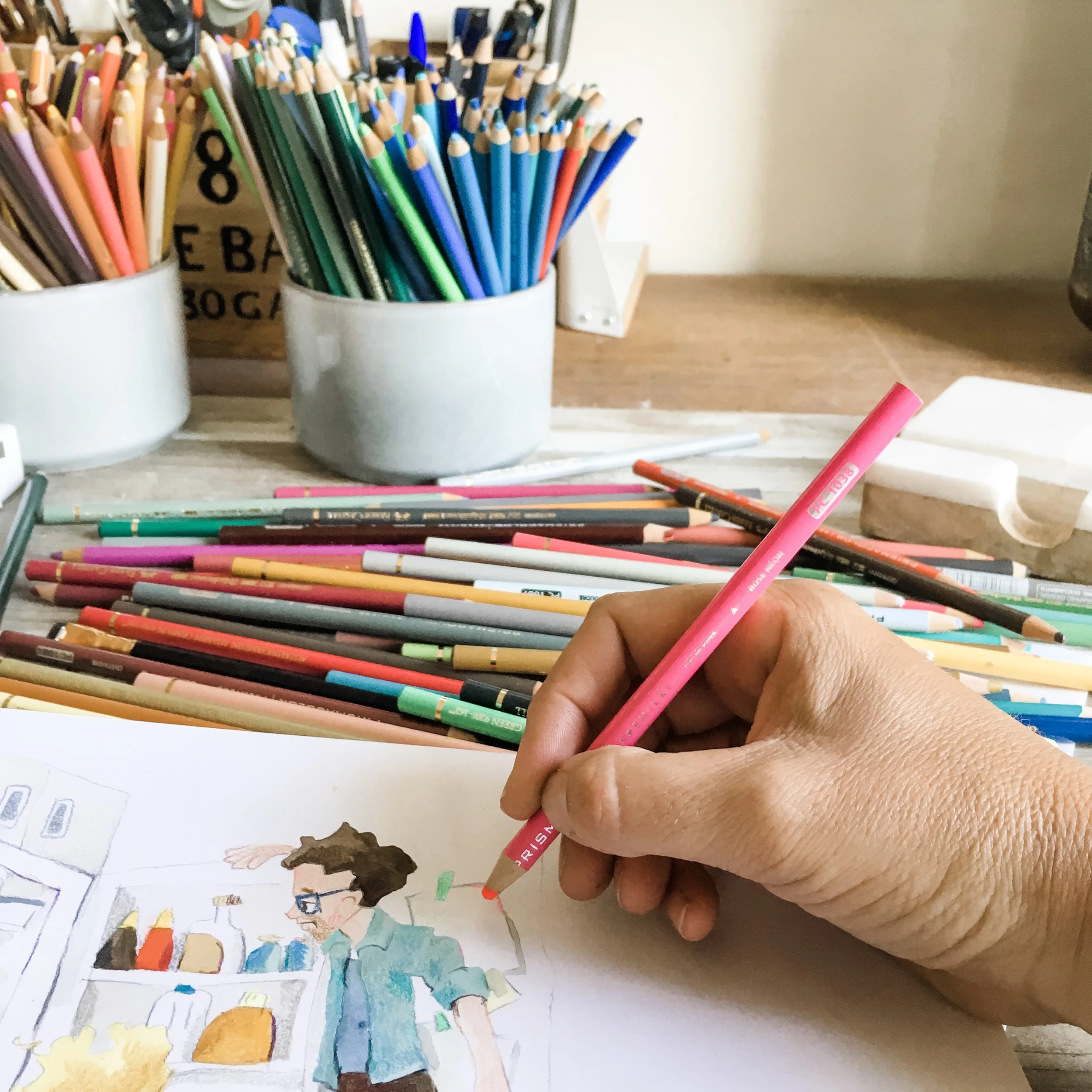
“Ruth de Vos’s illustrations in watercolour, pencil, screen-print and digital manipulation are clever, detailed, lively and full of fun and colour. There is a lot to look at and savour on every double-page.”
